Bean Bag Bazaar

The project

Bean Bag Bazaar are a top British soft furnishings e-tailer, with a penchant for unique and fun designs. As an online-only business, it’s imperative that Bean Bag Bazaar’s site is up-to-scratch and provides their users with a journey as seamless as their products. The team at Bazaar were concerned that their users were struggling with the purchase journey and wanted to understand if their suspicions were correct and, if so, what to do about it.

Instead of making changes based on assumptions, we set out to test the purchase journey to uncover what potential barriers users were experiencing on the site. Through UX research, we could pinpoint to the Bazaar team what was hot, and what was not, on their online store.

Remote usability testing

Through a usability tool, HotJar, we analysed heatmaps of mobile and desktop services’ homepage and category pages. Via session recordings, we could watch real users interacting with the product and basket pages. From the results, we created a high to low priority list of actions for Bean Bag Baazar to implement.  

Using this testing, we were able to gain a number of insights from the heatmaps including the need to redesign the category layout of the homepage in order to push the most relevant content to the top of the page. When on mobile, we found less than 50% of users were reaching their recommended products, which are useful in allowing users to skip a step in their journey and head straight to the product page – meaning time to checkout is accelerated. We also identified areas on the site where users were struggling to perform actions that directly impacted their purchase journey, such as adding to basket, and delved deeper into what was causing these issues.  

Usability testing enabled us to home in on areas of Bean Bag Bazaar’s site that would significantly benefit from improvements, uplifting the user experience and, ultimately, aim to boost conversion rates.  

Remote user testing

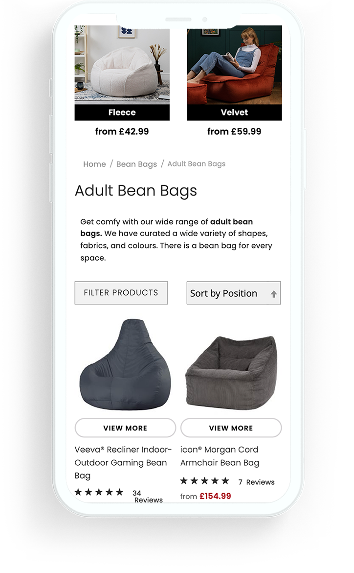
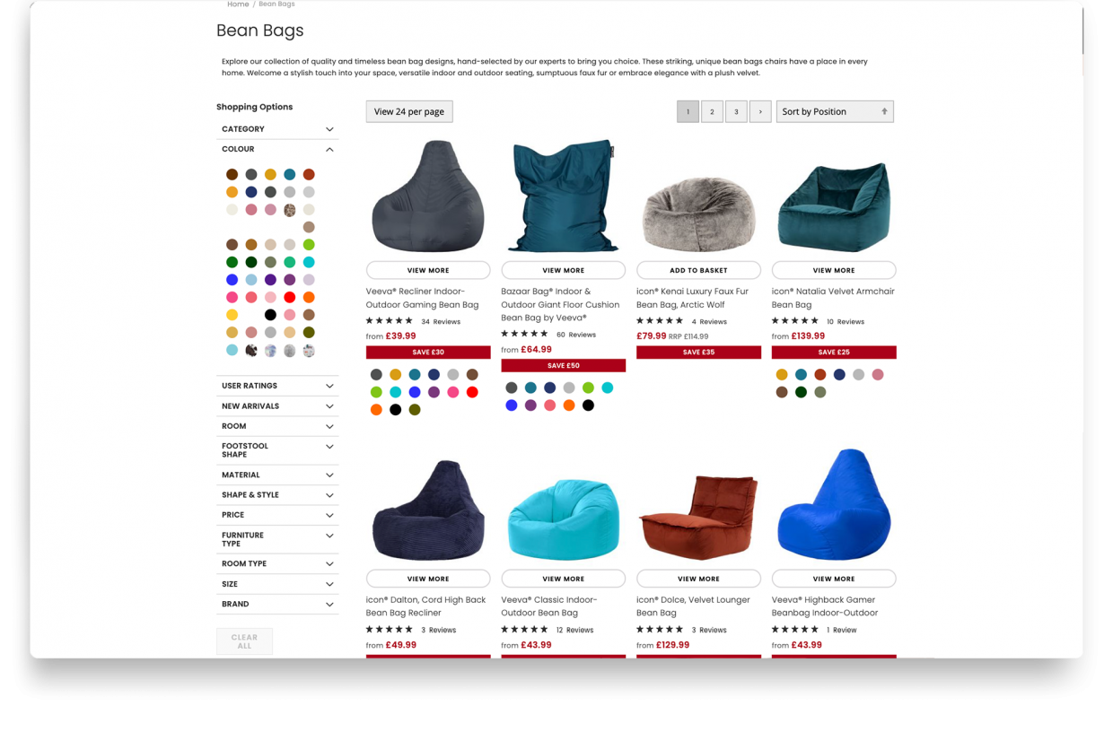
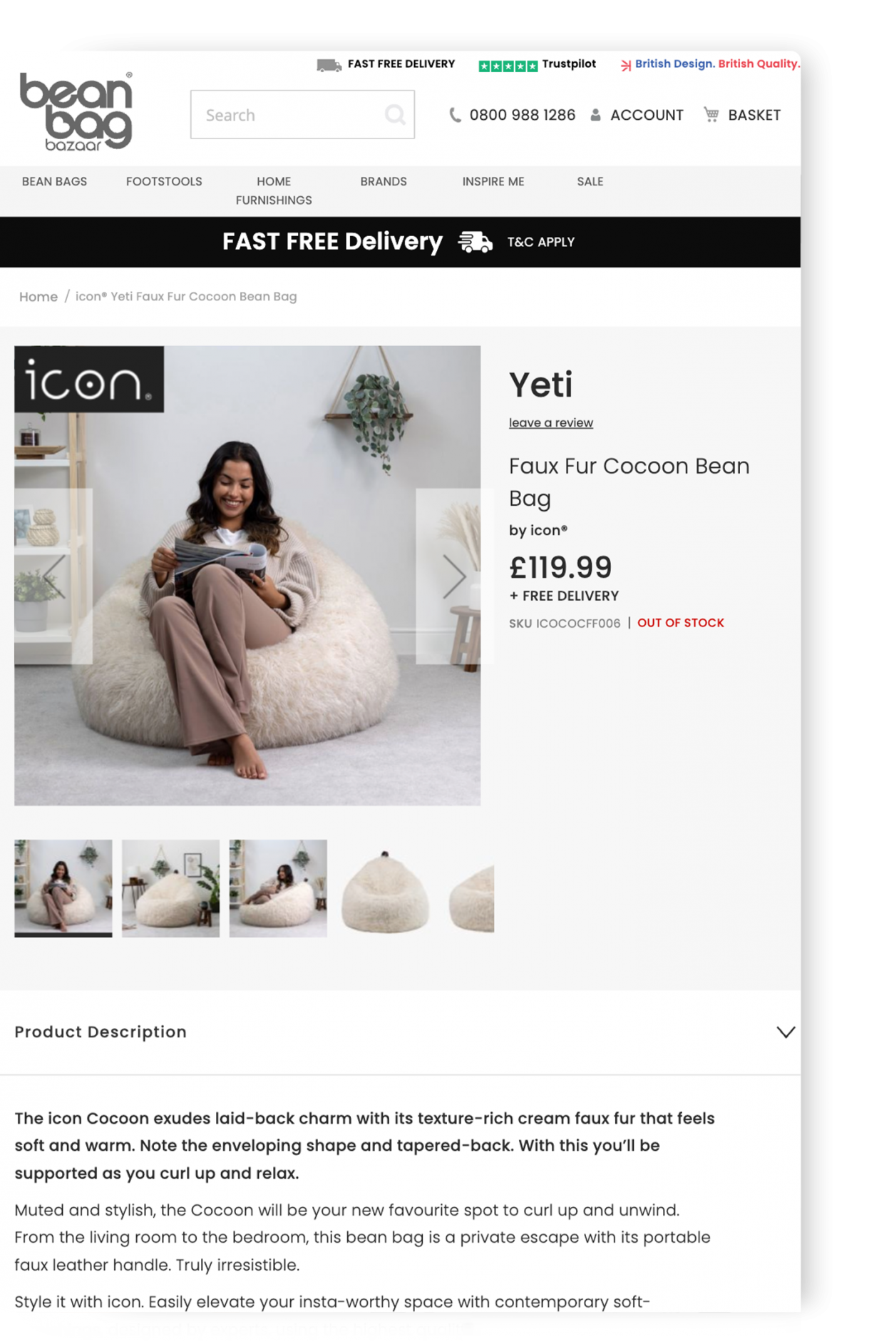
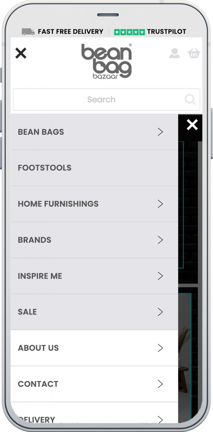
Next up on the agenda: discover how users navigate through Bean Bag Bazaar’s website. By understanding what users found easy, or not so easy, to navigate would provide us with a roadmap of improvements we could make. Our aim was to test the search functionality, understand purchasing decisions when buying different types of bean bags and to test the purchase journey, uncovering any potential barriers.

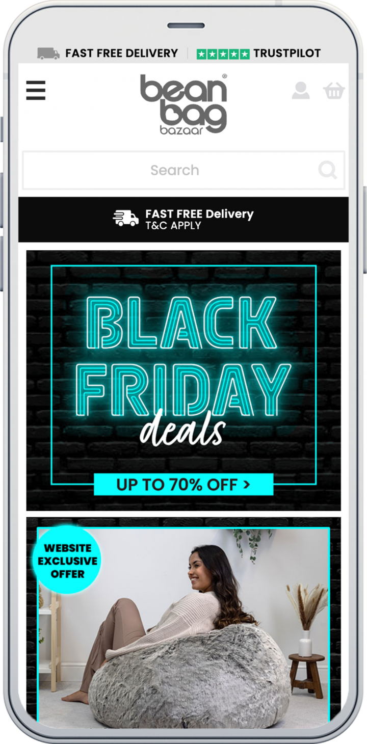
Recruiting 10 target users, we wrote a test script requesting they find specific items on the site, add them to basket and go through the full checkout process. Their screens and voices were recorded as they went through the tasks and we were then able to analyse their responses, focusing on trends or friction points throughout their journey. With generally positive feedback regarding the look and feel of the site, users found Bean Bags Bazaar to have a welcoming, friendly and colourful site – all things that add to the user experience.

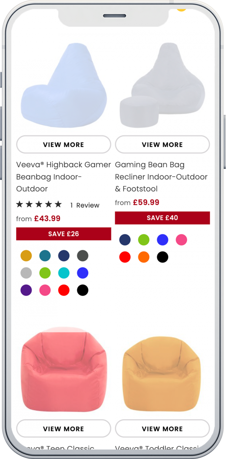
However, every single tester struggled to add items to their basket in different ways, showing that there were serious barriers preventing conversions. With this information in hand, we were able to suggest a number of improvements to alleviate the problem. While the focus of the usability review was to find ‘add to basket improvements’ we found a number of usability issues across navigation, search and basket touchpoints. These were fed back to the team at Bazaar to make the necessary changes to their site.

Although some areas for improvement were found, there were several areas on the site that users had extremely positive feedback for, such as overall search functionality and the look and feel of the site itself. These tests allowed us to show Bean Bag Bazaar what parts of their site could use a refresh and what parts were already cream of the crop.
  • Hell Bunny

  • Slurp